

This blog will cover the beginning to evaluation of my Advanced Portfolio media work. My research and planning can be found in earlier posts and the evaluation being found in my latest posts. (A2 ADVANCED PORTFOLIO) YouTube.com/ST3Maguire
Monday, 26 March 2012


Sunday, 25 March 2012
Empire Film Magazine
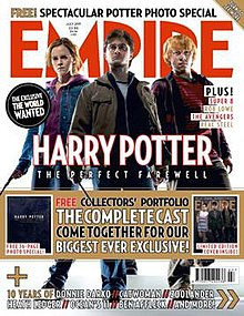 |
| Front Cover Of Empire Magazine |
http://en.wikipedia.org/wiki/Empire_(film_magazine)
Film Review Research Continued
| I will continue to research into Film reviews as I start the planning process of creating my own. I have been looking at Empire and British film magazine, as I feel that within the UK these two magazines are primarily more popular then their competitors. I also like the way they have set out their colour scheme and house style and will take this into account when creating my own ancillary film review. |
 |
| Front Cover Of British Film Magazine |
British Film is an online publication covering British film industry which is read by hundreds of people weekly. The magazine began as a print publication in 2005 before the launch of the online version in 2007.
British Film Magazine launched in London and Cannes 2005. Following three years of difficult development, it was a 108 page glossy Premiere Issue in March 2005, with 10,000 copies printed. That issue was sold in independent shops, specialist film outlets and Borders bookshops in the main cities throughout the UK. British Film Magazine is designed to report on every new British film on general release in Britain and all films released in Britain with major British talent involved, usually at directors or lead actor. It also reports on such films in production; on small budget British independent films and shorts, on training programmes in Britain and on British film or talent on DVDs.
Conventions Of Film Reviews
When creating my film review, I will need to research first the conventions that make a film review.The two reviews that I am researching in this post are from Empire Magazine. One being a double page spread and one being a single page, however despite their appearance their content in terms of conventions, such as the dominating image, look closer box and basic information box, are very similar.
I will take these reviews into account and will use them as a basis template for content and layout when I come to create my own film review.
At this current moment I am aiming to create a review on a single page as I believe it would look more aesthetically pleasing for the main image that I would be using. Also taking into account that most people will want to read the review, and if the review were to be too long, it could put people off reading it. In all if I were to create a double page spread, I don't feel as though it would be appropriate for a short film as there isn't too much that could be written about. Therefore I have decided to go for the single page review as I would be able to write a sufficient amount while keeping it interesting for the audience.
 |
| Single Page Review |
At this current moment I am aiming to create a review on a single page as I believe it would look more aesthetically pleasing for the main image that I would be using. Also taking into account that most people will want to read the review, and if the review were to be too long, it could put people off reading it. In all if I were to create a double page spread, I don't feel as though it would be appropriate for a short film as there isn't too much that could be written about. Therefore I have decided to go for the single page review as I would be able to write a sufficient amount while keeping it interesting for the audience.
.jpg) |
| Double Page Spread Review |
Thursday, 22 March 2012
Research Into Reviews
A film review is the analysis and evaluation of films, individually and collectively. In general, this can be divided into journalistic criticism that appears regularly in newspapers, and other popular, mass-media outlets. Film critics working for newspapers, magazines, broadcast media, and online publications, mainly review new releases. The plot summary and description of a film that makes up the majority of any film review can have an important impact on whether people decide to see a film. Poor reviews can doom a film to obscurity and financial loss.
Some websites, such as Rotten Tomatoes and Metacritic, seek to improve the usefulness of film reviews by compiling them and assigning a score to each in order to gauge the general reception a film receives. A number of websites allow internet users to submit movie reviews and scores to allow a broad consensus review of a movie. These websites specialize in certain aspects of film reviewing. There are sites that specialize on focus content of films, for example focusing on adviosories for parants to judge a films suitability for children.
I have included some hyperlinks below that will link to the more popular Film Reviewing sites so that you can see the conventions and style that they appear in.
Creating The Title (Font)
So after now deciding the genre and the feel that I wish to achieve with my poster. I have now started the creation process. I made the mistake in starting the photography that I wished to represent, but when creating the poster I need to start with the basics. I will now show the font that I will use within my final movie poster and how I optimized and manipulated it to match the format of my poster.
Step one: Identifying the font that I wish to use within my poster.
Bioshock has used a simple but effective font to represent the genre that it wishes to achieve, and with the critical acclaim and positive reviews it had recieved not to mention the strong sales over the years even to this day, it is evident that it had achieved its objective and in doing so has fulfilled its purpose.
So first things first I used google to search "Bioshock font" i fealt as though due to the font being so simple, it could have been made using Microsoft office properties, which if this was the case it would be more simple to create my movie's title.
Step one: Identifying the font that I wish to use within my poster.
Bioshock has used a simple but effective font to represent the genre that it wishes to achieve, and with the critical acclaim and positive reviews it had recieved not to mention the strong sales over the years even to this day, it is evident that it had achieved its objective and in doing so has fulfilled its purpose.
 |
| The Original Bioshock Logo |
 |
| Identifying the font using Yahoo Answers |
The above screenshot shows the source of information as to how I found out which font I will need to use within my poster. It had been identified as CENTURY GOTHIC a font found in Microsoft Office. However by using the website http://www.dafont.com/ it has an altered font, which reflects this genre more.
Step two: Using and optimizing the chosen font.
 |
| The downloaded font found at Dafont,com |
The above screenshot shows the font that I will be optimizing in the final ancilary task. When using da font, it enables me to change the text, so that it represents my movie "THE FOLLOWING" as seen in the screenshot below.
Step 3: Creating and editing the downloaded font
 |
| The title of my short film, how it will be portrayed in the downloaded font |
Once the title of my Movie had been entered into the font that I wished to use. I simply now needed to download the font, and with the use of Microsoft Office, I could then write using the newly downloaded font.
Due to my final poster, following the conventions of film noire, I would need the background of the font to be black and the text contrasting with the use of a white colour scheme. I decided to use paint this time as the program is easier to use then those such as Photoshop of fireworks for this specific task.
The last step shown above shows me inverting the colours within paint. I need to invert the colours in order to match the colour scheme that I aim to create and replicate the genre seen in my earlier posts.
I did not use the video above to help me with the process of creating my text, but after the creation process I had found this video on YouTube, and it follows pretty much the same process with some minor differences. If you would like to replicate the design that I have used this video would be helpful for future purposes and demonstrating.
Due to my final poster, following the conventions of film noire, I would need the background of the font to be black and the text contrasting with the use of a white colour scheme. I decided to use paint this time as the program is easier to use then those such as Photoshop of fireworks for this specific task.
 |
| The final step in creating my posters film title |
I did not use the video above to help me with the process of creating my text, but after the creation process I had found this video on YouTube, and it follows pretty much the same process with some minor differences. If you would like to replicate the design that I have used this video would be helpful for future purposes and demonstrating.

Subscribe to:
Posts (Atom)